

Tools: Adobe Illustrator / Sketch / Zeplin / Adobe Photoshop / Adobe InDesign
HiRoad gives drivers the power to lower their own premiums, and the brand was built to make that feel like a win. I partnered with the creative director on its 0-to-1 brand design, building the identity, illustration, UI, and print materials from scratch.
A brand built on driving data could easily feel cold, so my first step was to do a brand audit and competitive analysis to see what insurance looked like and where HiRoad could feel different. From there, I explored identity concepts. One of my first ideas became the wordmark: an underlined “Hi” that works as a friendly hello and as taking the high road.
From there, I moved into the product UI, data visualization, and an illustration style. The first illustration direction felt too playful for an insurance brand, so I dialed it back to something more grown-up but still approachable.
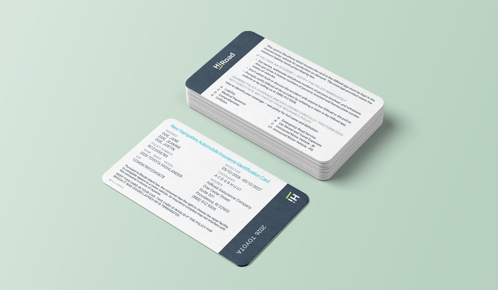
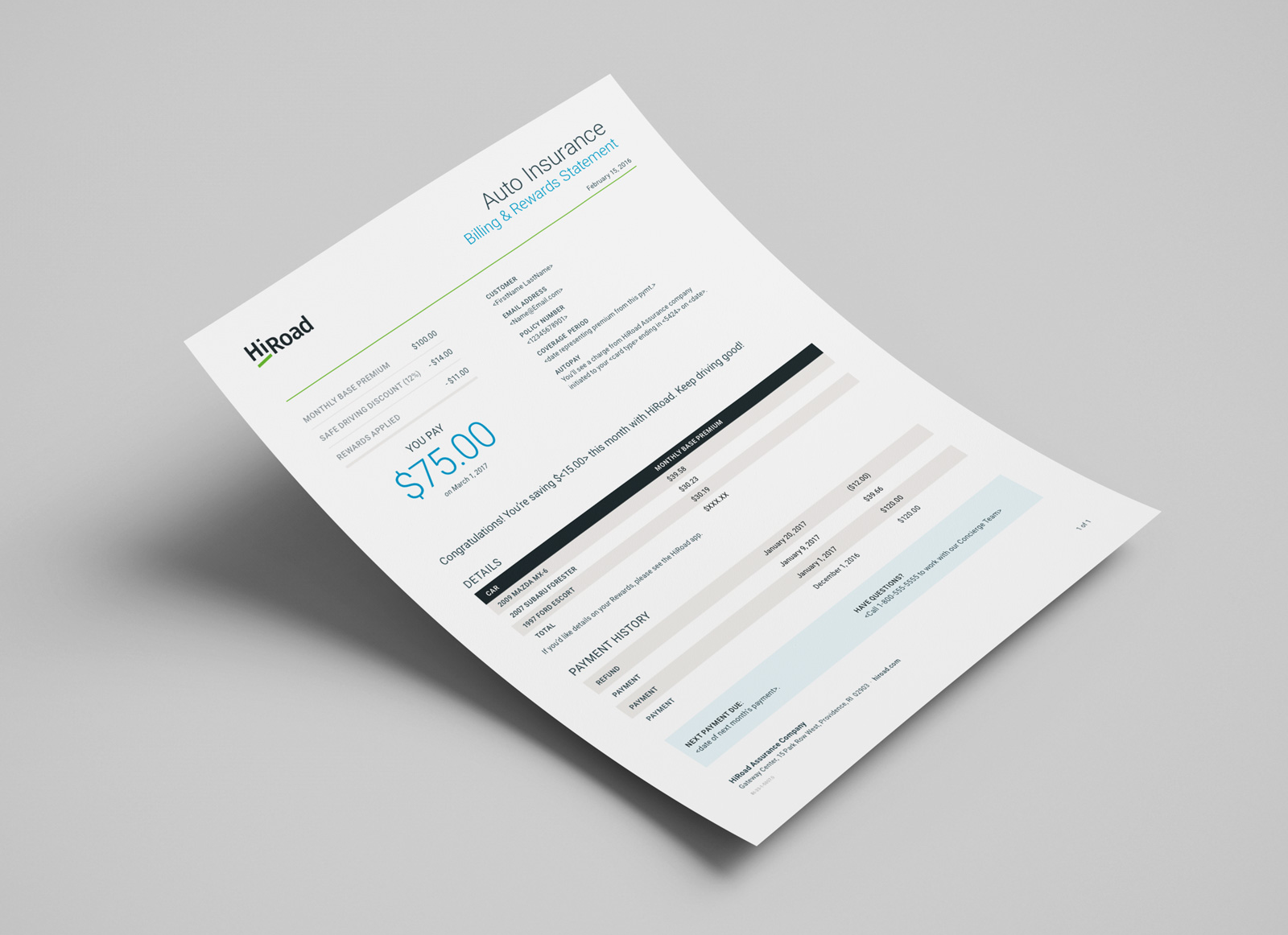
We were building the plane as we flew it, so everything had to stay flexible as the product took shape. I designed the icon system, a clean line style built to stay clear at small sizes, along with the brand’s contracts, statements, ID cards, and other print materials, handing off final files for production.
Later, I came back to create additional illustrations in the newly established style.

The color palette was intentionally balanced between technical and approachable. Gray gave the system a grounded, precise feel, fitting for a brand built on data and driving behavior, while the blues and lime green kept things feeling human and inviting rather than cold or corporate. That same lime green from the logo carried through the illustrations, tying the brand's visual language together from the wordmark down to the smallest icon.

As part of HiRoad's visual identity, I designed the brand's icon system with precision. The goal was clarity and simple consistency throughout.


I created this textured, limited-palette illustration style for HiRoad's original brand, built on blues, grays, and the lime green from the logo. I was later brought back to create illustrations within their newly established brand style. Scroll down to the bottom to see some of that flat vector work.
A recurring lime green car became something of a signature icon for the brand, a small, recognizable character that showed up throughout the product and marketing materials, reinforcing a sense of personality and warmth in what could otherwise feel like a purely transactional insurance experience.
In the HiRoad wordmark logo, a double meaning plays out: "Hi" sits slightly above "Road," visually taking the high road while also reading as a friendly, approachable "hi" or "hello." Colors are set in a dark blue-gray, grounded and trustworthy, with a lime green underline beneath "Road" that adds energy and warmth without losing that sense of credibility. The mark reflects HiRoad's mission to reward mindful, thoughtful decisions behind the wheel: confident and principled, but approachable rather than corporate.
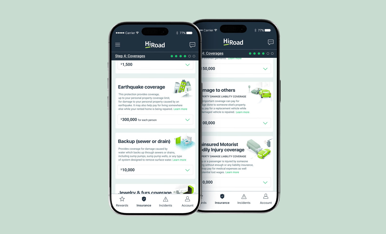



I was later brought back to create illustrations within HiRoad's newly established brand style. You can see some of that work below:

