

Tools: Figma / Procreate / Adobe Photoshop / Adobe Illustrator
HOPWTR’s brand was already established when the creative director brought me on to design the UI. I designed the subscribe-and-save flow to be clean and intuitive, and paid close attention to color contrast to keep the palette accessible and readable. I designed a set of bold, vibrant icons to bring energy to the interface and developed unique, textured spot illustrations to add personality. I also documented the system in a Figma style guide so the interface stayed consistent as it evolved.

I designed HOPWTR's Subscribe & Save UI using the brand's established color palette. I focused on creating a clean, easy-to-use subscribe-and-save flow that kept the experience simple and frictionless.

I created a set of vibrant, bold icons to give the interface personality and energy, using color contrast that kept them readable and accessible.

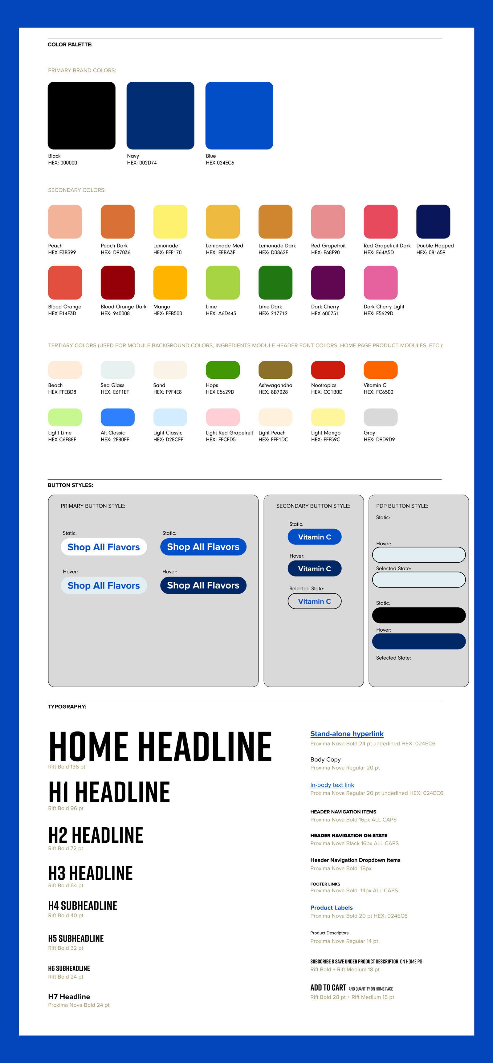
I built an easy-to-reference style guide in Figma covering HOPWTR's color system, button styles, and text treatments, keeping the interface consistent as it grew. This was also where I was most deliberate about accessibility, selecting color contrast ratios to keep the bold palette both vibrant and readable.

I created unique, textured spot illustrations for HOPWTR's UI, adding personality and visual interest to the interface beyond the core icon set.

